This is my first sketch, I liked the fish but I just couldn't seem to tie him in with anything.
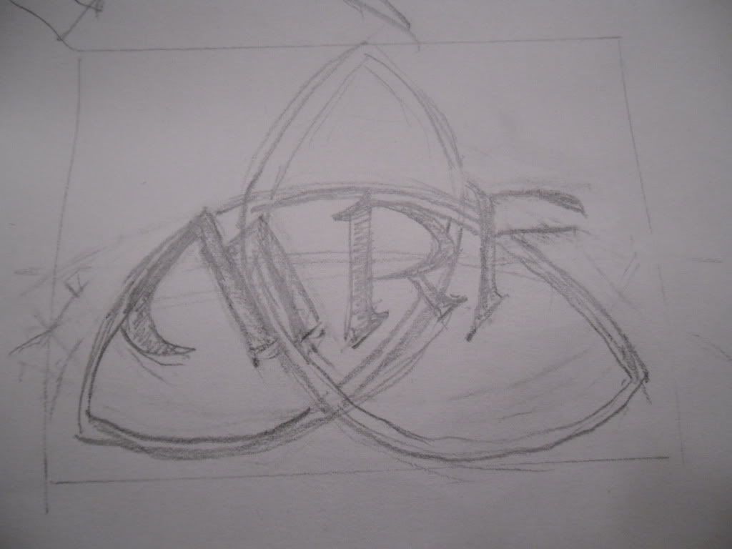
The next two sketches were of my initials. I thought if I could draw them using some Celtic Font and maybe some sort of Rune behind them, that I would be satisfied..no go on those either.
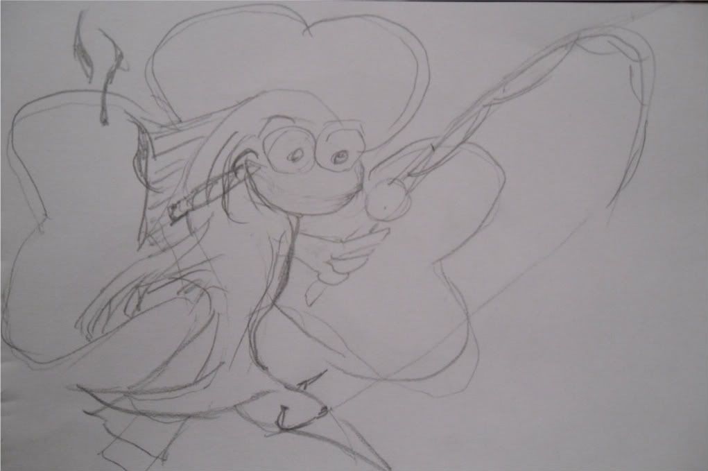
I then decided to revisit the fish theme. I thought a fish catching himself, smoking a cigar with a clover tatoo. Yeah, it came close but wasn't going to cut it. He was cool looking but just seemed too busy.
Since I thought this one was too busy I decided to go simple and came up with the next sketch that actually ended up being my logo. This wasn't the last sketch but the one that I ended up using. I actually think this sketch ended up looking better than my final logo. Once I inked my logo there really wasn't anyway to go back.
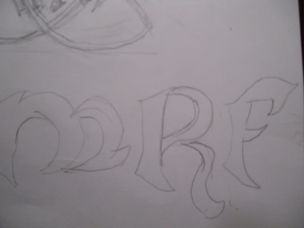
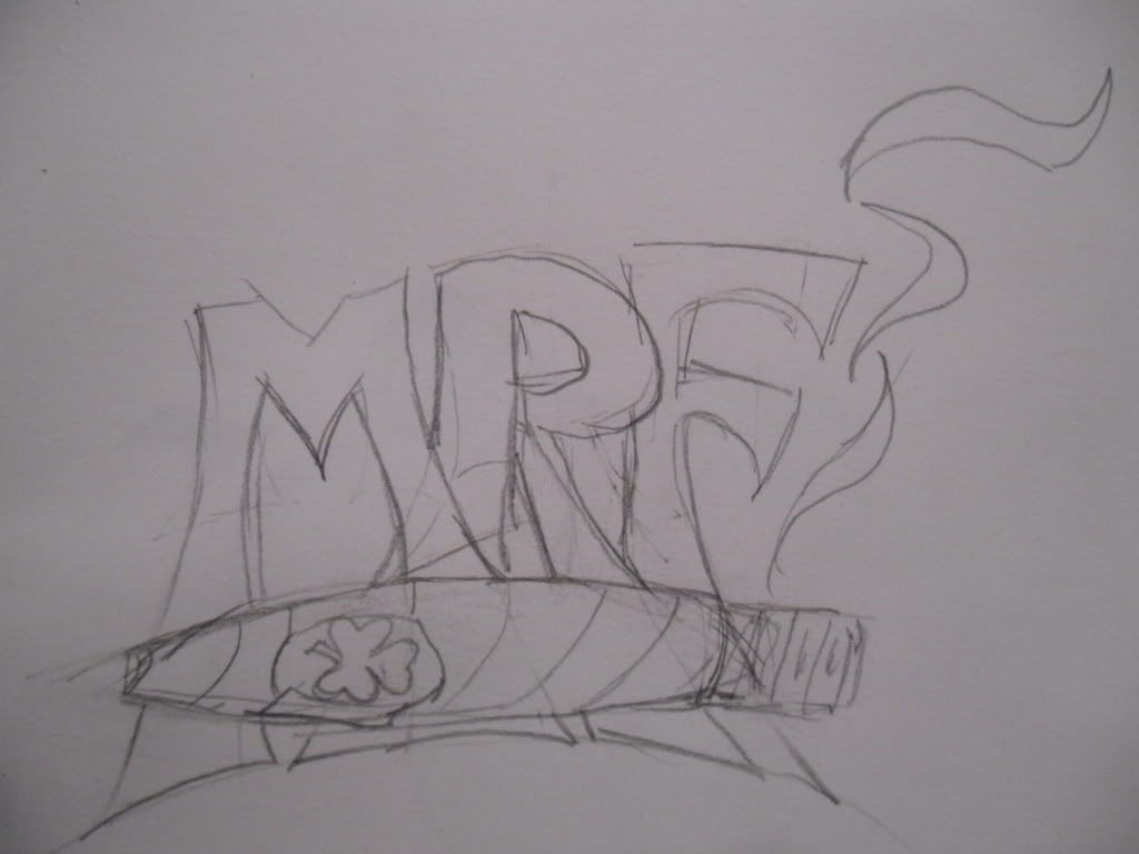
I went back to my initials and just made up my own font and stuck it above a cigar. This again was my attempt at keeping it simple. I didn't much care for this one either. The thought behind it was big guy, big initials, cigar with a touch of Irish. It wasn't horrible but I finally decided on the previous sketch.
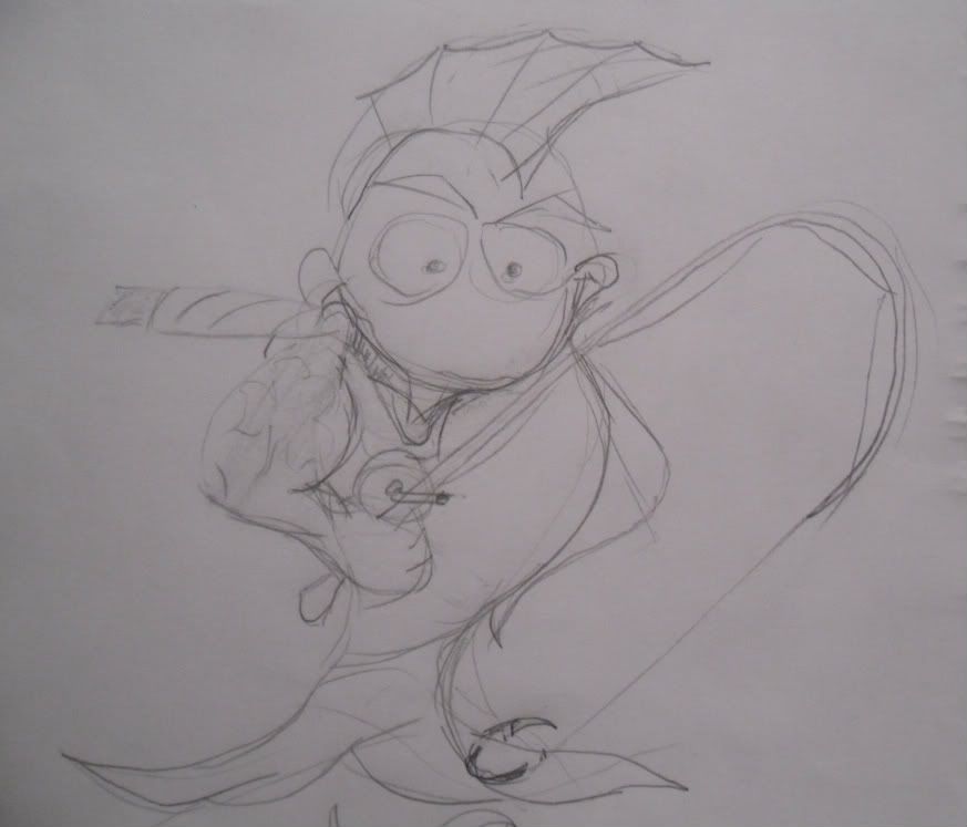
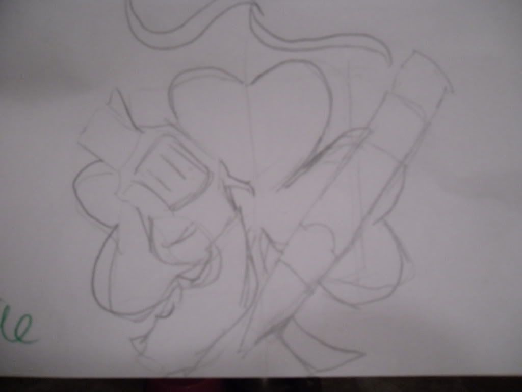
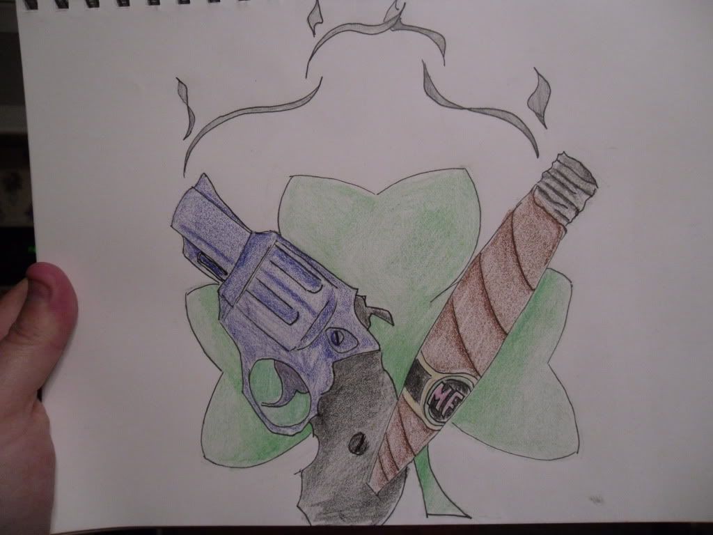
I tried to combine everything into this sketch. I left out the fishing but kept the cigar, pistol, Irish and initials theme. I tried to keep everything pretty balanced and included a little movement using the smoke. I wasn't sure how to balance out the negative space between the clover and the smoke. As you can see, I'm not much for using color and shading. This is a rough process for me but I pushed on. My daughter decided to help herself to my colored pencils so what you see is a colored pencil/crayon hybrid. Looking back I should have rounded the clover leafs a little more to resemble the initial sketch. I think when I was drawing up the final logo I forgot to look at the sketch.
I guess creating a logo wasn't as stressful as I thought. The whole process was pretty cool and I took some cues from the videos that did help a bit. Adding the smoke at the very last minute was something that I took from the one video. I wanted to take something and give it movement. Keeping it simple was another concept I learned along the way. I actually enjoyed watching the videos, the creative process is great to watch. Taking an initial concept and moving along to an end result that for the most part didn't really look like the initial at all. The Marmite video was interesting, to think it took them months to come up with a new container much less a logo. Trying to keep a brand the same but updating and modernizing it doesn't seem as easy as I thought.
Of course I show my blog to my family and I notice that my final Logo didn't show up..all fixed now, lol.
ReplyDelete